Category Archives: Web Design

Translate regular text or HTML code into script language write code

Have you ever needed to take regular text or HTML code and write out in a scripting language? If so, you know it can be a pain in the ass to switch all the quotes to backslash-quotes (JS/PHP) or double-quotes (ASP). In my limited searching I couldn’t find a tool to do this quick function, so I made my own. You might find it useful.

Simply type your text or code into the first box, click the button for which language you want it translated into, and you will have code you can cut and paste.


Election night

Well, that was fun. After seeing some good roundups of election night graphics and a few personal tours by the designers themselves (such as Khoi Vinh of the New York Times and Nathan Borror of the Lawrence Journal-World) I thought I’d share my own rundown of what we did at Minnesota Public Radio for election night results.

First off, the big deal was the special election block on the homepage, which included a live map of the governor’s race and a balance of power for both national and state houses, both of which were updating behind the scenes without having to refresh the page.

Minnesota Public Radio election night homepage

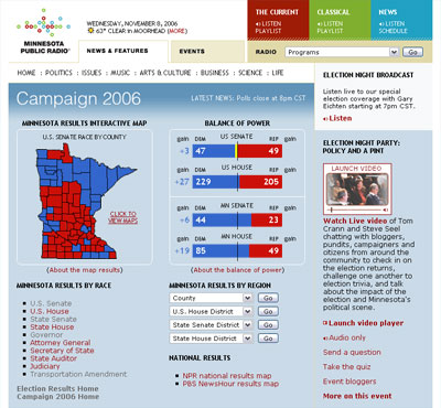
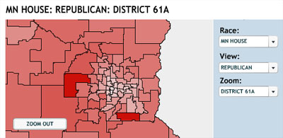
The other big thing was the interactive results map, which allows you to see up-to-the-minute results without having to refresh, drill down to specific counties and districts, and even switch the view of the map to see the geographic strengths and weaknesses of specific parties. Notice how I didn’t have to include a screenshot of those? That’s because there’s permalinking to specific zooms and views. There’s also switching back and forth from Flash to HTML versions of the results because of that fact. Here’s a screenshot anyway:

Minnesota Public Radio election results interactive map

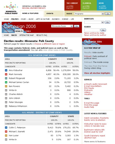
I personally don’t think there’s nothing terribly amazing about our basic results pages, except for the fact that I consider them to be fairly readable, digestible, don’t look like pre-packaged crap from an outside supplier, and just the fact that there are a lot of pages, which allows you to look at however general or specific you want to be.

Minnesota Public Radio election results

Another interesting part of our election results was the fact that we gave them to anyone else who wanted them, through our election results widget. Places who used it ranged from personal sites to political bloggers to small town papers to political parties themselves, and the customization ranged anywhere from not having to do much to a fantastic super-customized approach. There were even times were you could get our results faster from somewhere other than our own site, due to our traffic load. This may seem strange, but I think that’s kind of an awesome public service.

In general the night went rather smooth, even while having almost 10x the usual amount of traffic. The data retrieval from the Secretary of State slowed up a bit later in the evening due to a similar kind of media crunch on their end, but data still eked out along the way. I’d love to hear any comments or criticism on anything you see on the site or in the interactive maps, because hey, I hear this kind of thing is happening again in a few years.

The olden days of online news

In reading this article entitled “Newspaper.com visitors up by nearly a third, NAA says”, I didn’t realize that “newspaper.com visitors” was just a way of saying “online newspaper visitors” in a general sense, so I was quite surprised when I got to the real newspaper.com.

At the site, it is not a newspaper conglomerate such as News Corp, Gannett or Knight-Ridder, but instead some fantastic screenshots of “the world’s first international multimedia online newspaper, News In Motion“, which existed from 1993-1996 and was eventually usurped by the web. My guess is that the reason the site is still around is because the domain name is worth a pretty penny, but it’s still nice to see some insight into some older online news thinking with the splash page, ISSN number, and button navigation.

A cyclical call to arms for weblogs

There are a lot of mixed feelings I get when I see people like Jeffrey, Greg, and Tomas talk about the lament of blogs and design.

For one, it’s nice to see that people are in the same boat as me, where sometimes there’s no time or inspiration to blog. Sometimes you need a break, sometimes a break needs you. Sure, when people can’t or don’t post, I don’t get to read them… but I understand.

Also, it’s nice to see that people still care about taking the time to craft something, particularly around the web and blogs. The bad part about that is that since people keep bringing it up every year or two, it’s not done. The good part about that is if you’re interested in helping craft a solution, it’s not done.

Should photos be considered printer-friendly?

Recently someone at work printed an article from our site (like this one, for example) and wondered where the images were.

If you print it (or save some trees and just look at a print preview to see what you would get), you will notice that the presentation is largely different from what you get on the web. It is using print styles in the CSS to hide various things, such as the navigation, sidebars, and photos. It also displays a different, more minimal footer. What this printer-ized version tells you is where it came from, how to contact them, and the text of the story.

One argument for not displaying the photos is based on why people print out web pages: simple reading, reference, filing, or forwarding. Another argument is printer ink: The majority of people who tested this site mentioned that the reason they choose “printer-friendly” or text-only versions of a page was so that the images would not print. Why? The cost of printer ink. Printer ink costs more per drop than vintage Dom Perignon, so that’s quite understandable.

One stated argument for printing the photos is that, since this is a news story, they are also “telling the story” and thus should be preserved.

I really don’t know that there is one true answer to this, but I’m interested in your opinion on the matter, or perhaps some more arguments for and against printing photos from a web page. What do you think?

Well-designed news sites

Over time I have bookmarked news media sites that I find particularly well-designed. In particular I like to have the home page be the largest factor because of all that it usually has to cover, but I am also interested in well-designed “common” pages, such as a simple news article or collection/index of news articles. I am posting them for posterity’s sake, but also to hopefully garner some suggestions from the audience on sites that I am missing out on. These could be television, newspaper, radio, strictly online, or perhaps even something loosely based on any one of those. Here they are, in no particular order:

  • BBC

    I actually liked their previous iterations better, but this home page is still an exercise in clarity and simplicity, given the scope of the organization. I wish more people could sell designs like this to similarly-sized companies.

  • Bayersicher Rundfunk

    Nothing particularly breathtaking, but definitely organized and fairly uncluttered given the circumstances.

  • Australian Broadcasting Corporation

    An excellent example of an organized bevy of text links. Could use some design polish, but it is very skimmable (is that a word?)

  • Chicago Public Radio

    Nothing spectacular here, but a decent sense of design and restraint (although possibly because the rest of the site is fairly shallow.)

  • Deutsche Welle

    The top navigation, map, and graphical arc are a poor use of real estate, but the rest of the page is templated and fairly well kept. This site would probably go downhill real fast if it had banner ads.

  • dradio.de

    I love the boxed grid system, the simplicity of the navigation, and the choice of HTML over graphics in alot of places. Although some might argue the grayscale color scheme is a bit boring, I like how they use blue/red combo to both make the radio services stand out from the gray, and also connect the radio services from the top navigation to the right content column. A terribly clean gridded design.

  • Schweizer Radio DRS

    An excellent grid system on several pages. I particularly like the display of the radio services across the middle. Although I’m not a fan of color-coding every section of a web sites, they at least handle it well by termpering everything with alot of gray. The news stories need some help, and those photos in the bottom right of people with headphones frighten me.

  • Inc.com

    For all the ads and ad-like content on the homepage, I can still skim fairly well. The icon system and font size/color variety help alot with that. I love that header bar. Great design on the home and story pages, especially with way too many ads.

  • International Herald Tribune

    The poster child for out-of-the-box news story thinking. The clippings feature and the customizable three-column pageable story text have been around for years, and people are still trying to copy it. Amazing stuff. Clean, simple, excellent grid system. I don’t think I’m alone in this, but I totally love the serif headline with sans text. I’m also a sucker for horizontal line backgrounds, good icon sets, and (if you hadn’t noticed it yet) grayscale color themes.

  • Lawrence Journal-World

    The poster child for news site innovation in (at least) the U.S., along with it’s sister site lawrence.com. Decent grid system and color scheme, but I also wish they would use HTML more often, like for the “services” block, and for all the section headers on the page like “latest stories” and “local sports”. (By the way, what the hell are “top ads”? Who are you kidding?) I like the potential of the very large graphical news block at the top, but I’ve never seen it executed to much effect. The photos and accompanying display font text are lacking. Can’t get enough of the dynamic weather graphic.

  • MDR (Mitteldeutscher Rundfunk)

    I absolutely love the cropped horizontal photo space on the home page. The simple navigation, grid, and color scheme aren’t half bad either. I like the balance of HTML text/navigation and graphics/photos.

  • NDR (Norddeutsche Rundfunk)

    I’m a big fan of the top navigation bar with the logo, photos, sharp colors, and subtle rollover links. Great grid, good typography. The double-wide photo space on the first story in a list is a nice touch.

  • WDR (Westdeutscher Rundfunk)

    Lots of spacing, big text, and thumbnails. The icon system could use a little work, but at least they have one. A very clean design, with a good balance of text and graphics.

I will add more comments to the rest of these as I get more time…

Please add suggestions in the comments!

Posting purgatories and the public transparency and cross-pollination of links and sources

I am beginning to enjoy my array of available posting purgatories, along with the public transparency and cross-pollination of links and sources. Now I can have multiple levels of filtering, yet I (and everyone else) can see the original sources, such as my personal editorial process: scan all the content sources (bloglines.com/public/magnetbox), filter out the interested portions (del.icio.us/magnetbox), and decide what the general public gets to see (magnetbox.com).

I can’t help but think it would be amazing if content sources (news organizations?) did sort of the same idea, so that people could decide for themselves what level of news/filtering fits them best.

Should Safari be intentionally buggy?

Phillip Winn responds to my foul-mouth post about Mark’s post about being “intentionally buggy”:

  1. It’s a beta product. Last time I remember any browser coming out with a public beta, it’s been used and trashed about just like Safari, except there weren’t people fighting back (for the product.) For some reason a buggy, non-standard browser is being catered to hand over fist, after everything every developer has had to go through for over 5 years.
  2. “ALL browsers are buggy. This isn’t just like a browser from 1996, it’s like any other browser in 2003.” That’s exactly the problem. Every other browser in 2003 is buggy and sucks, yet Safari is starting from scratch in 2003 and only comes up to par with the current state of every other browser.
  3. Kottke’s argument is that it should do more to distinguish itself. Sure, that would be nice. Maybe it’ll happen in the next release. But Kottke’s hotly-disputed suggestions aren’t about fixing bugs, they’re about creating a whole new class of product that doesn’t exist.” I think what Jason and I are saying is their idea is short-sighted. They are the ever-innovative Apple, yet come out — in 2003 — with a run of the mill (at best?) web browser?

Safari is buggy

I can’t believe this kind of conversation is even happening. It’s a fucking buggy, non-standard-compliant browser. You have to treat it like it’s a browser from 1996, since we’re talking about how to hack around it/for it, and about all the mistakes that every other browser made before. How can people accept something like this from any new browser? How about if we just don’t use it, and it just might go away and make Apple realize that it’s bad — hell, even unnecessary? Is there something I’m not seeing here, something I’m missing?

A day spent using a screen reader

Wow. Spending a day on the ol’ JAWS screen reader does wonders. It’s amazing what little tidbits of accessibility tweaks you can get, even from browsing sites you’ve built with aspirations of true accessibility.

Some unofficial suggestions:

  • Use emdashes ? not hyphens ? to pause in a sentence.
  • Hyphenated words are awkward, because the dash is read out loud.
  • If you use an icon to denote the type of link, don’t use brackets or parentheses in the ALT tag. It’s looks nicer in text browsers, but sucks in speech.
  • Using the same text for both the ALT tag and caption of a photo is awkward, because it reads the same thing twice in a row. Suggestions? Email me.
  • Use labels and link titles to their fullest extent.
  • Good grammar and punctuation is crucial, such as putting an apostrophe when referencing eras/decades (like the 1990’s.)